

Identity for Micro Festival
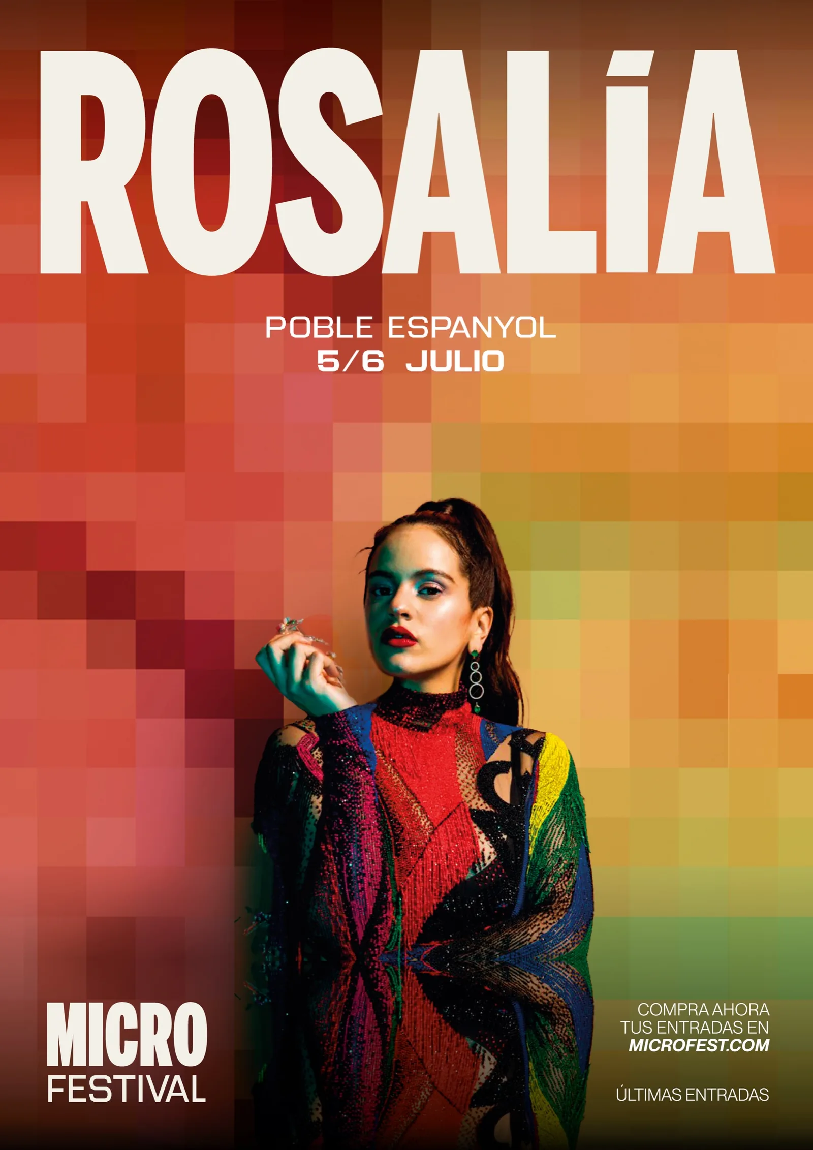
An identity built on the tension between micro and macro: pixels taken from the bands' photos become texture, background and type.
- Branding
- Art direction
- Visual identity
- Packaging
The brief
Micro is a music festival that brings together scales, formats and experiences. The identity had to carry that idea onto every surface: poster, screen, ticket or record.
What we did
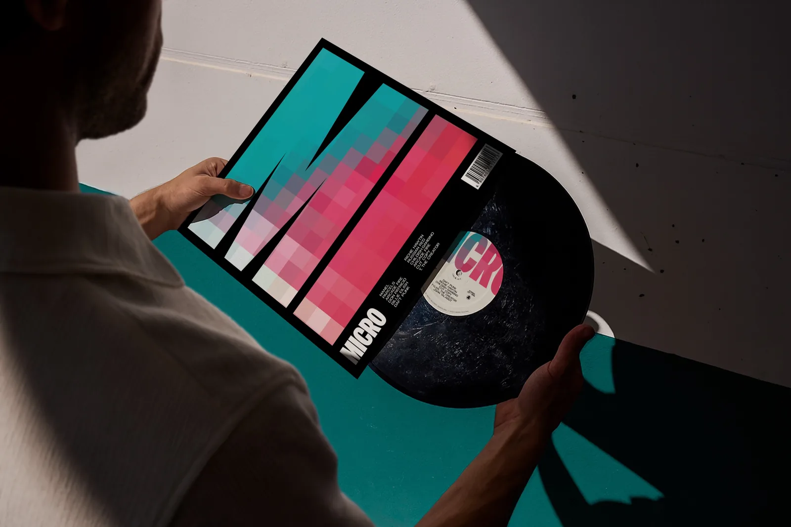
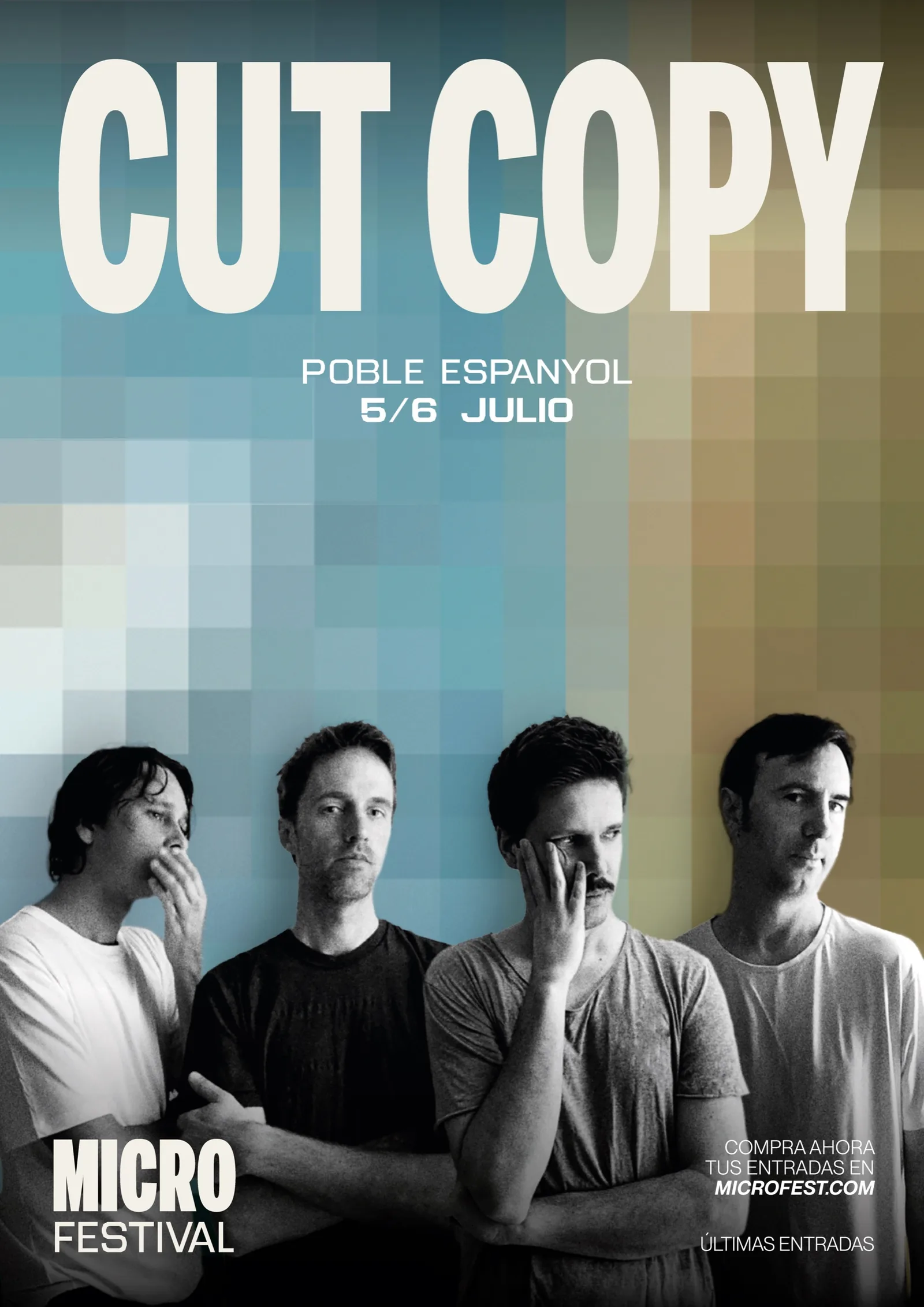
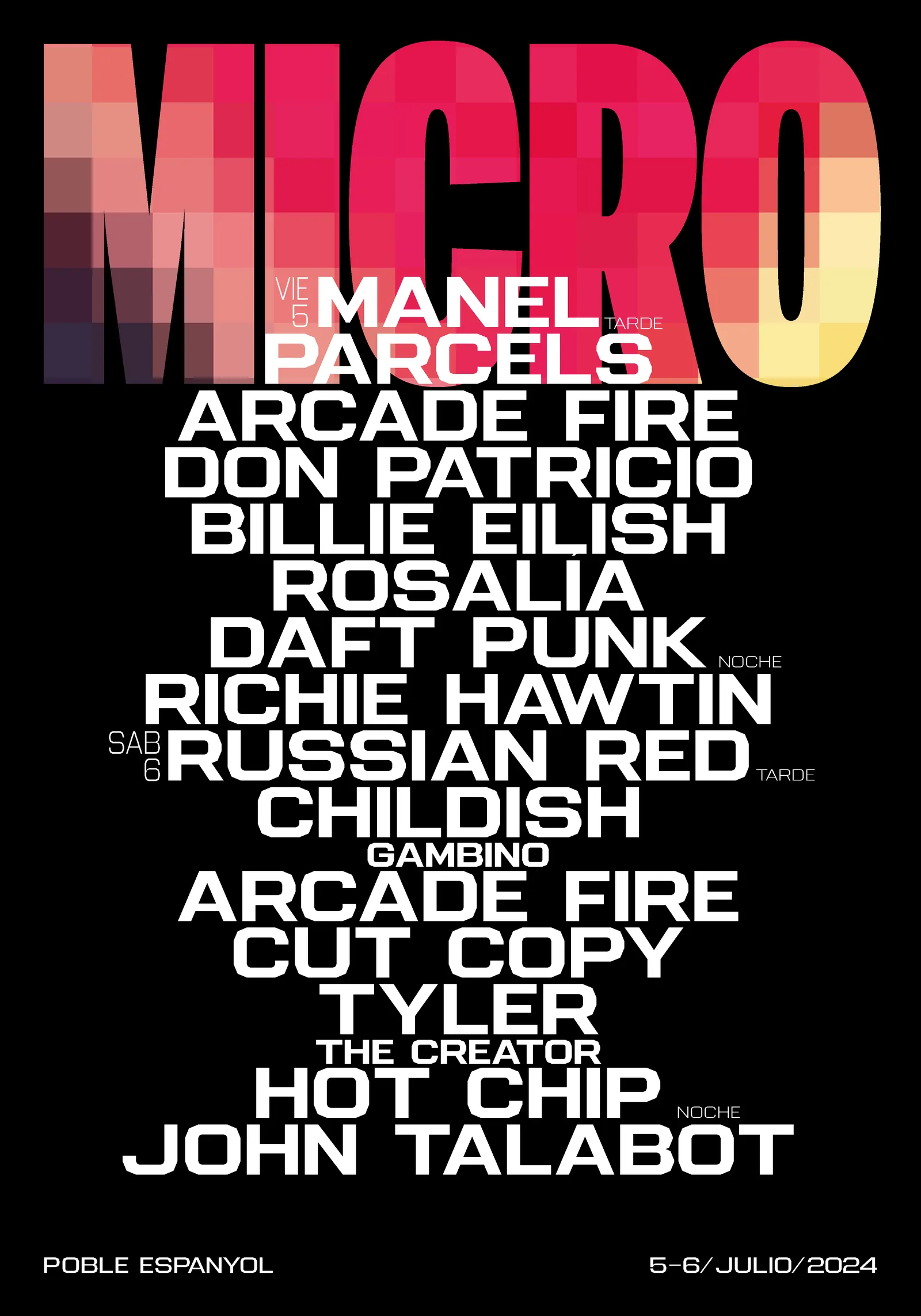
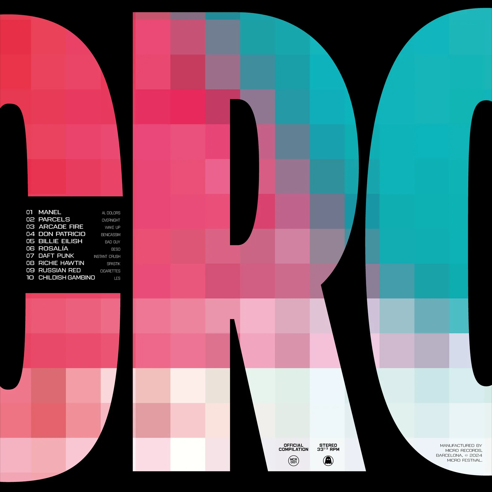
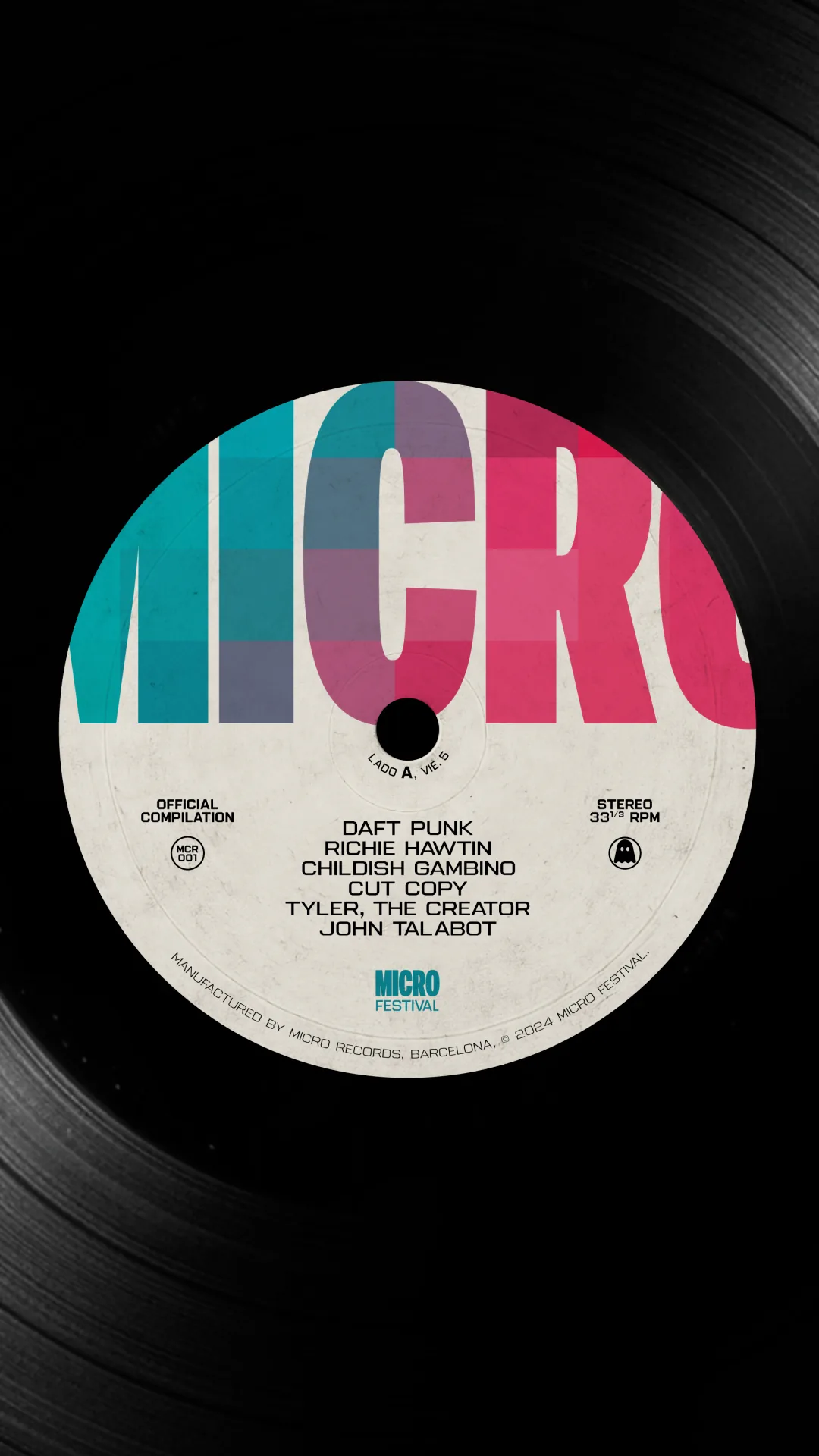
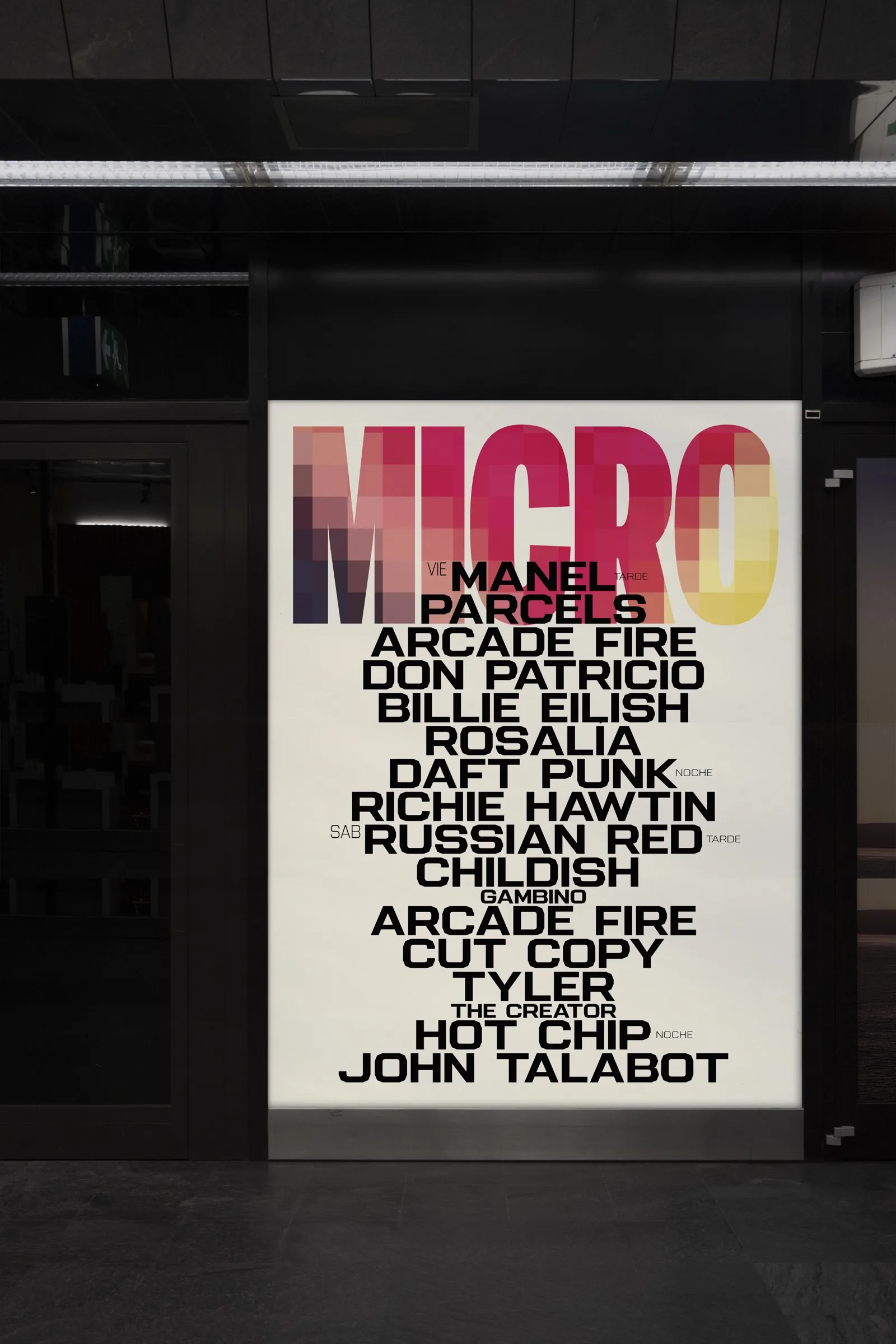
Pixels are the backbone. They show up as texture, as background and as typographic fill, and each one comes from a real photo of the bands on the bill. Against them, large blocks of type.
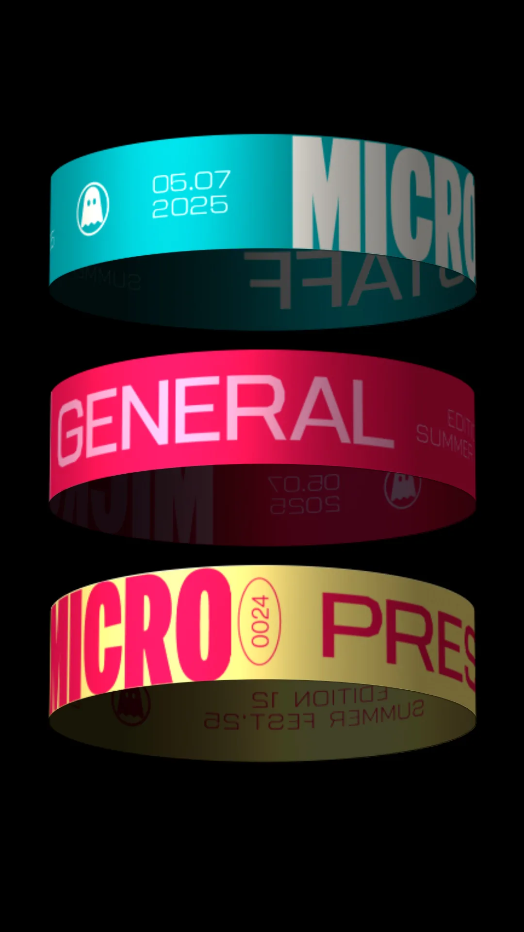
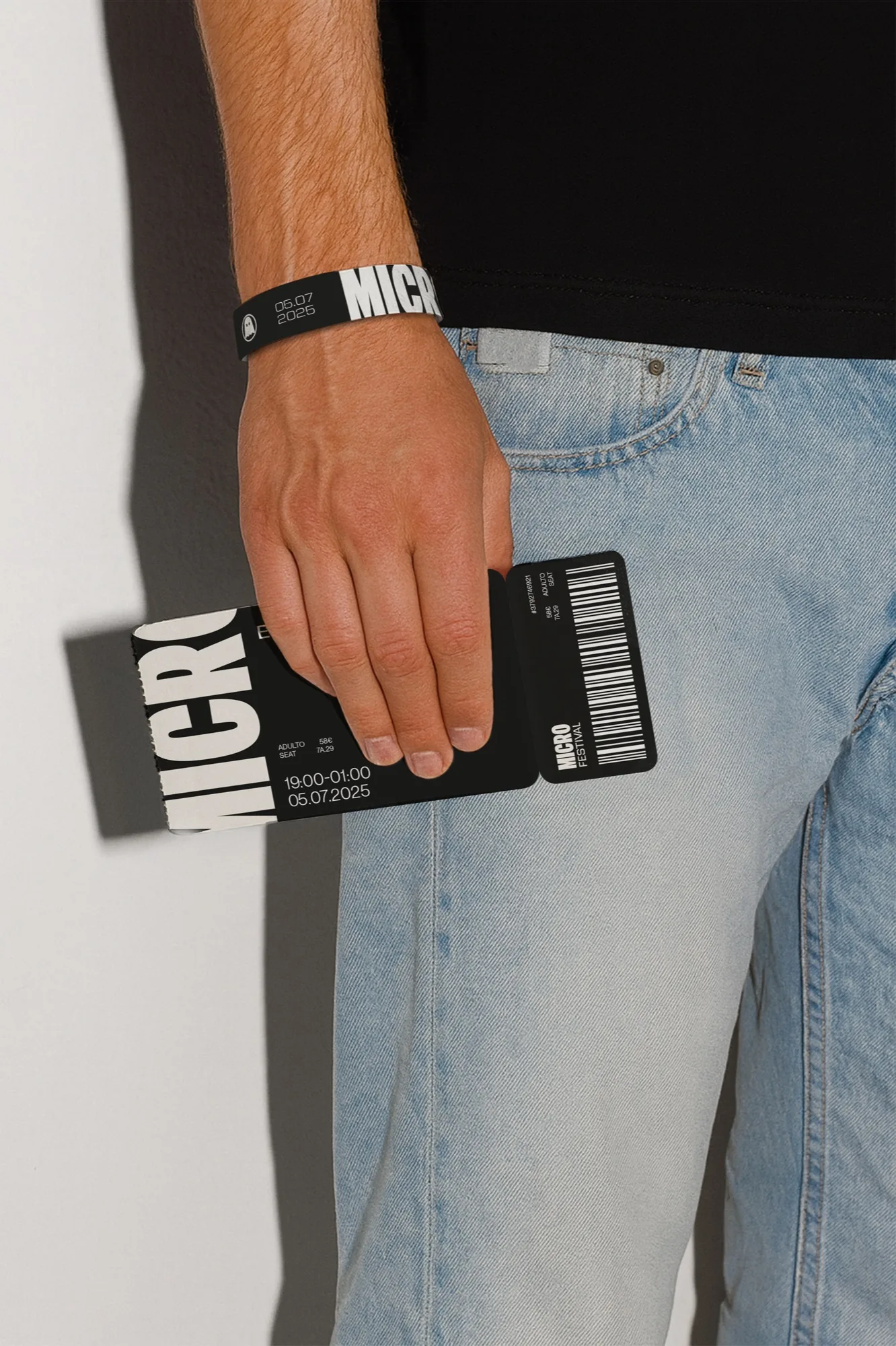
The colour range comes straight from the source photos, so it shifts with each artist without losing unity. Applied to artist posters, a vinyl release, ticket and wristband, merchandise and stage.
Art direction and design: María GM, Eje Creativo.


Start with a free consultation
Before quoting anything we want to understand the project: what you need, who it is for and what it has to achieve. Tell us about it and we will explain how we would approach it.
Book the free consultation