

Identity and posters for Encara Lab ceramics school
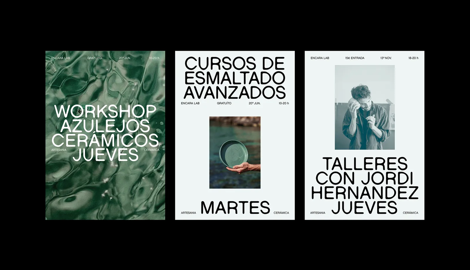
A visual system that changes its skin each season: sea, earth and nature. Organic type, clay marks and natural-light photography.
- Branding
- Posters
- Art direction
- Illustration
The brief
Encara Lab runs ceramics courses, workshops and classes. It needed an identity that felt handmade yet current, and that could refresh every season without losing recognition.
What we did
Organic type, textured circles that recall the imprint of wet clay, and a palette per edition. Photography carries the story: teachers at work for the classes, natural textures for the workshops. Each type of activity has its own poster structure.
Three seasons
First edition, the sea: turquoise, white and blue, image in the centre with headlines above and below. Second edition, the earth: ochres and clay tones, full-bleed photography with the type at the top. Third edition, nature: beige and dark green, smaller type and more room for the image.
Beyond the posters: logo, posts and stories, an information website and an editorial piece.
Art direction and design: María GM, Eje Creativo.


Start with a free consultation
Before quoting anything we want to understand the project: what you need, who it is for and what it has to achieve. Tell us about it and we will explain how we would approach it.
Book the free consultation